Read More
SECTION 01
Fixed width images are grouped so that a maximum width can be set on desktop. These should be used wherever NDC currently use 3 columns set to 25 / 50 /25. The width of the group is set, in pixels, in: Block > Layout.
NDC routinely add images in 3 column blocks set to 25 / 50 / 25 width. This is not recommended for a few reasons: (1) images are too large on wider desktop windows and too small on narrow windows and tablet. (2) The width of individual images cannot be adjusted, so 4:5 images are too wide and landscape images are too small. Instead we recommend using the fixed width images (above), which give the editorial team full, granular control over the width of each image in a post on desktop.
Full width images serve as visual breaks, helping to divide different sections or ideas within the post, thereby improving the flow and readability. They also give the impression that time and effort have been invested in creating the content, thus boosting its credibility. To add a full width image just make the group it’s in 100% width in the Block > Layout tab.
There are numerous ways to add two columns of images and all of the granular settings to control the padding, can be found in the right hand Block > Styling panel. Typically these are set to 1200 or 1400px wide in the Group > Layout panel.
Spacing can be removed by selecting the Columns element and setting the Block Spacing to 0 in the Block > Styling panel, creating a similar effect on desktop to a traditional double page spread.
One important note when adding this block is that captions have to be added in a separate Columns block, or the grey background colour extends under the right image. To adjust the quote width to perfection on desktop; simply adjust the % width of the centre column.

this is a large block quote, set to ‘H3 Editorial’ size, Ivar Display, Uppercase, with 1.3 line height and 0.2 letter spacing
The Responsive Mobile & Desktop Image module is for inserting a separate images for mobile and desktop. The desktop image only displays on desktop and the mobile image is displayed on a mobile. This is useful in headers, when the Hero Image field is not being used.
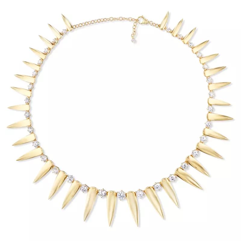
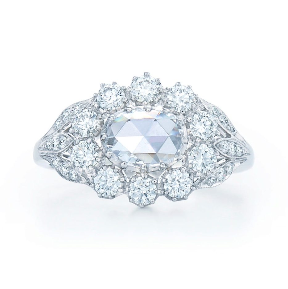
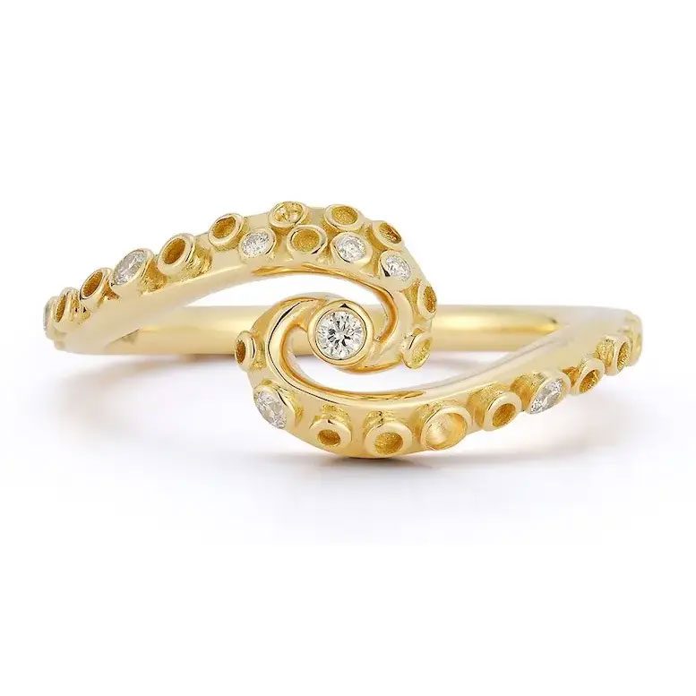
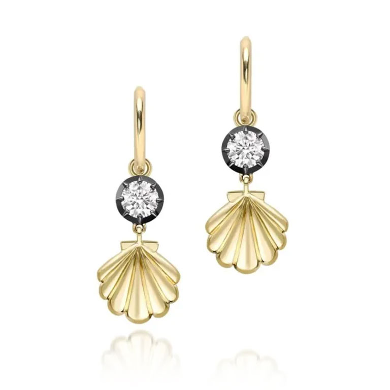
These sliders are a great way to display a mix of jewelry, images, videos and quotes. The settings in the Styling tab include the option to force images to a square aspect ratio, display a carousel on mobile and add an image overlay color—which is useful when featuring jewelry shot on a white background.
Hailey Bieber
Heart the Stones
Megan Thee Stallion
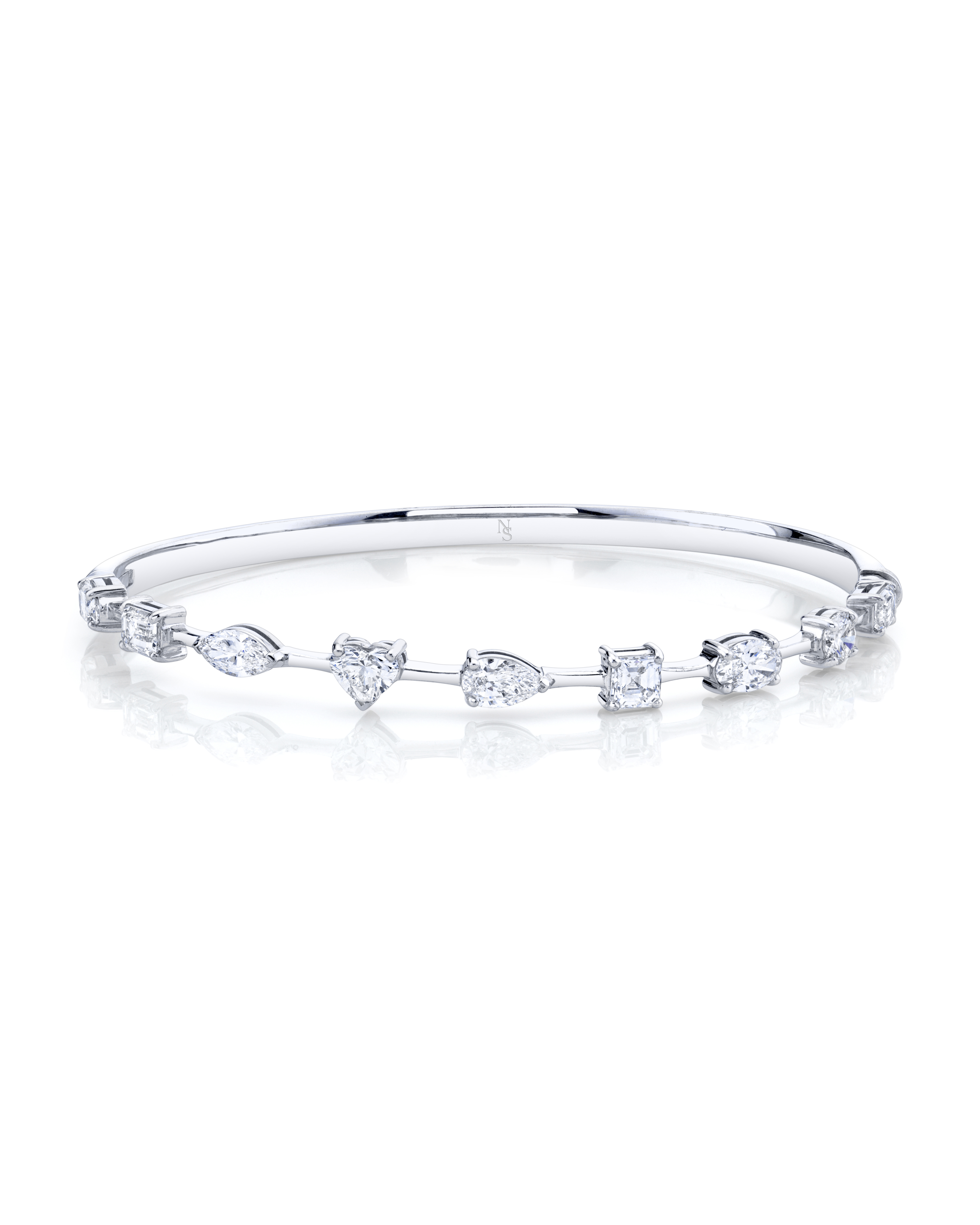
Norman Silverman
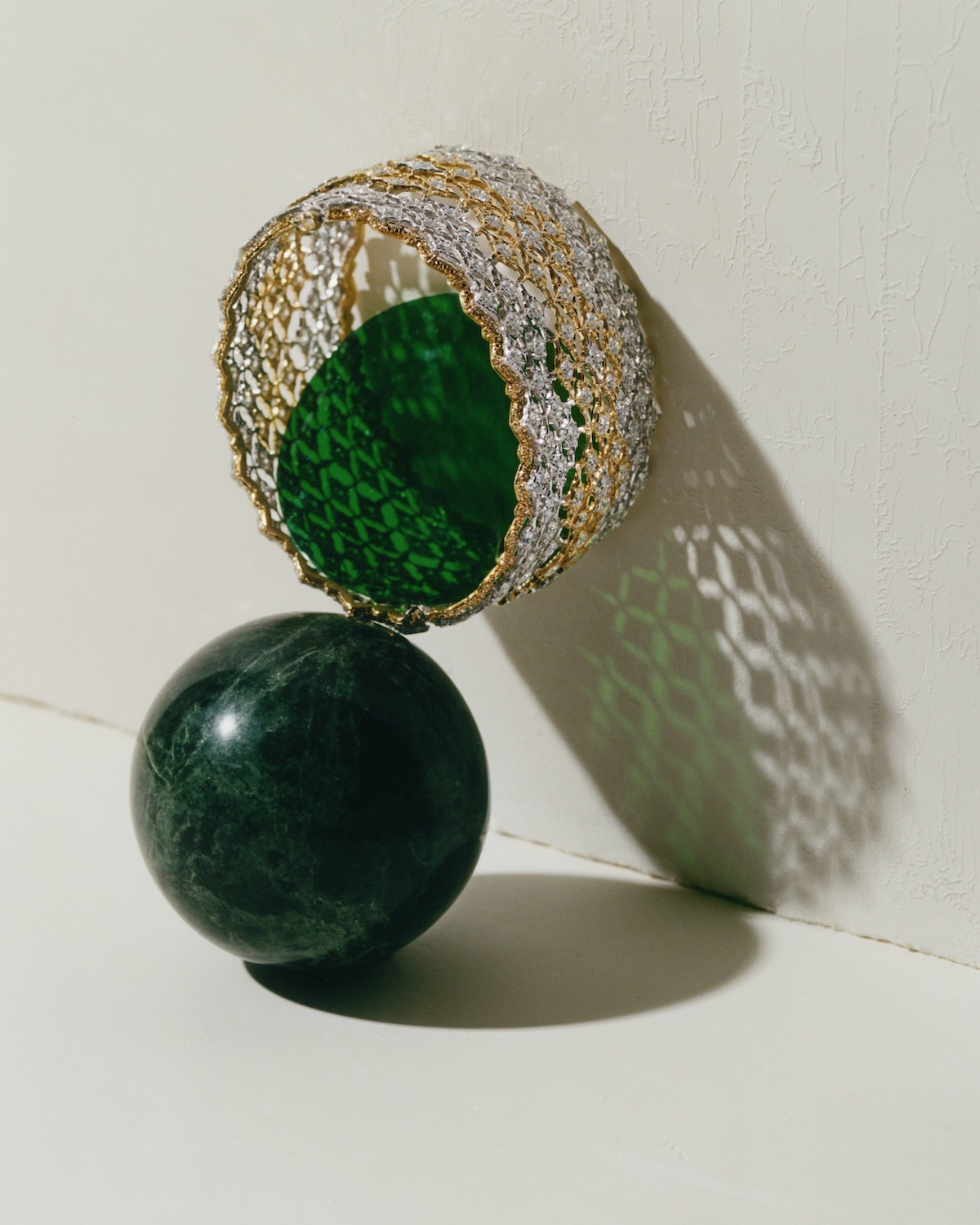
Buccellati Rete D’Oro Bracelet from the Vintage Collection
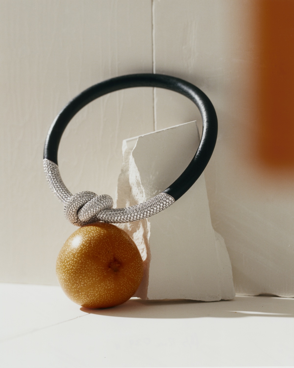
Boucheron Bois Brûlé Diamant Necklace
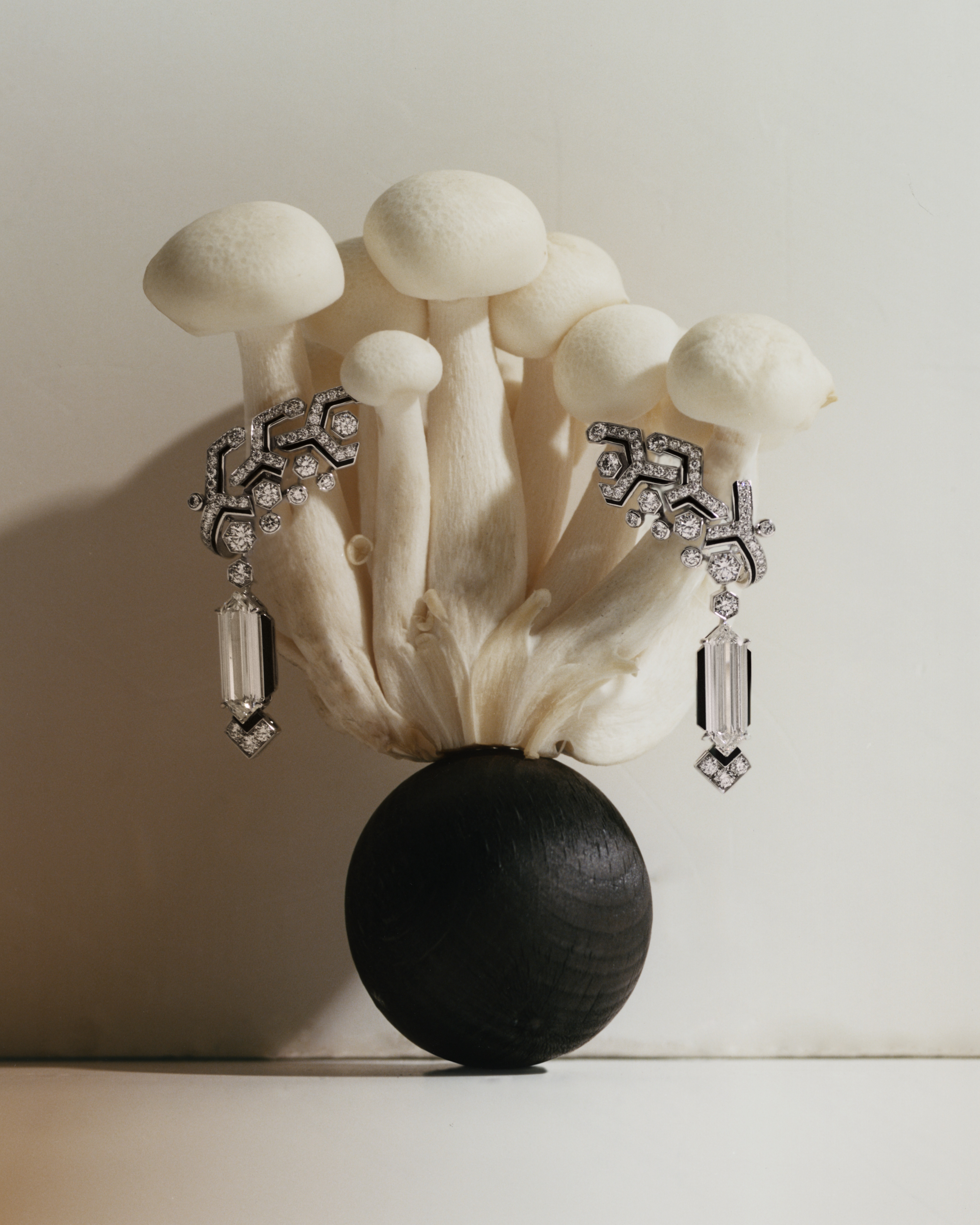
Cartier Oktogon Beautés Du Monde Earrings
Cartier Ryu Beautés Du Monde Necklace
De Beers Frozen Capture Earrings
Van Cleef & Arpels Sparkling Waves Necklace
Adding an overlay color in the Styling tab is useful when featuring jewelry shots with a white background—to avoid these looking like they have too much whitespace.
The ‘Image overlay color’ value should be a light tint of black. The last number added is the percentage of the tint, e.g for 2% black: rgba(10,10,10,0.02).
CAPTIONS — CAPS OR SENTENCE CASE
CAPTIONS — CAPS OR SENTENCE CASE
CAPTIONS — CAPS OR SENTENCE CASE
CAPTIONS — CAPS OR SENTENCE CASE
CAPTIONS — CAPS OR SENTENCE CASE
For Listicles and Red Carpet stories the Infinite Slider can include a title, body copy and vertical captions (a toggle in the Styling settings). There are options to either display as a slider on mobile or to stack the posts vertically.
Vertical Captions — Set with a Toggle
Vertical Captions — Set with a Toggle
Vertical Captions — Set with a Toggle
Vertical Captions — Set with a Toggle
Vertical Captions — Set with a Toggle
This module is perfect for situations where you need three or four images, spanning the full page width on desktop and displaying as a slider on mobile.
The In-Article Slider module works well on mobile if you need a full width, simple, looping gallery of products or images without slider arrows.
CAPTION – 13PT DIA CAPS
CAPTION – 13PT DIA CAPS
CAPTION – 13PT DIA CAPS
The Editorial Featured Products Slider is ideal for jewelry where four items are shown on desktop and just one on mobile. For larger product images choose the Editorial Infinite Slider module shown in the Images & Sliders section above.
The Editorial Featured Products Slider is ideal for jewelry where four items are shown on desktop and just one on mobile. For larger product images choose the Editorial Infinite Slider module shown in the Images & Sliders section above.
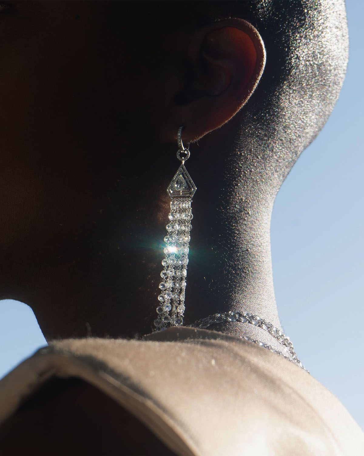
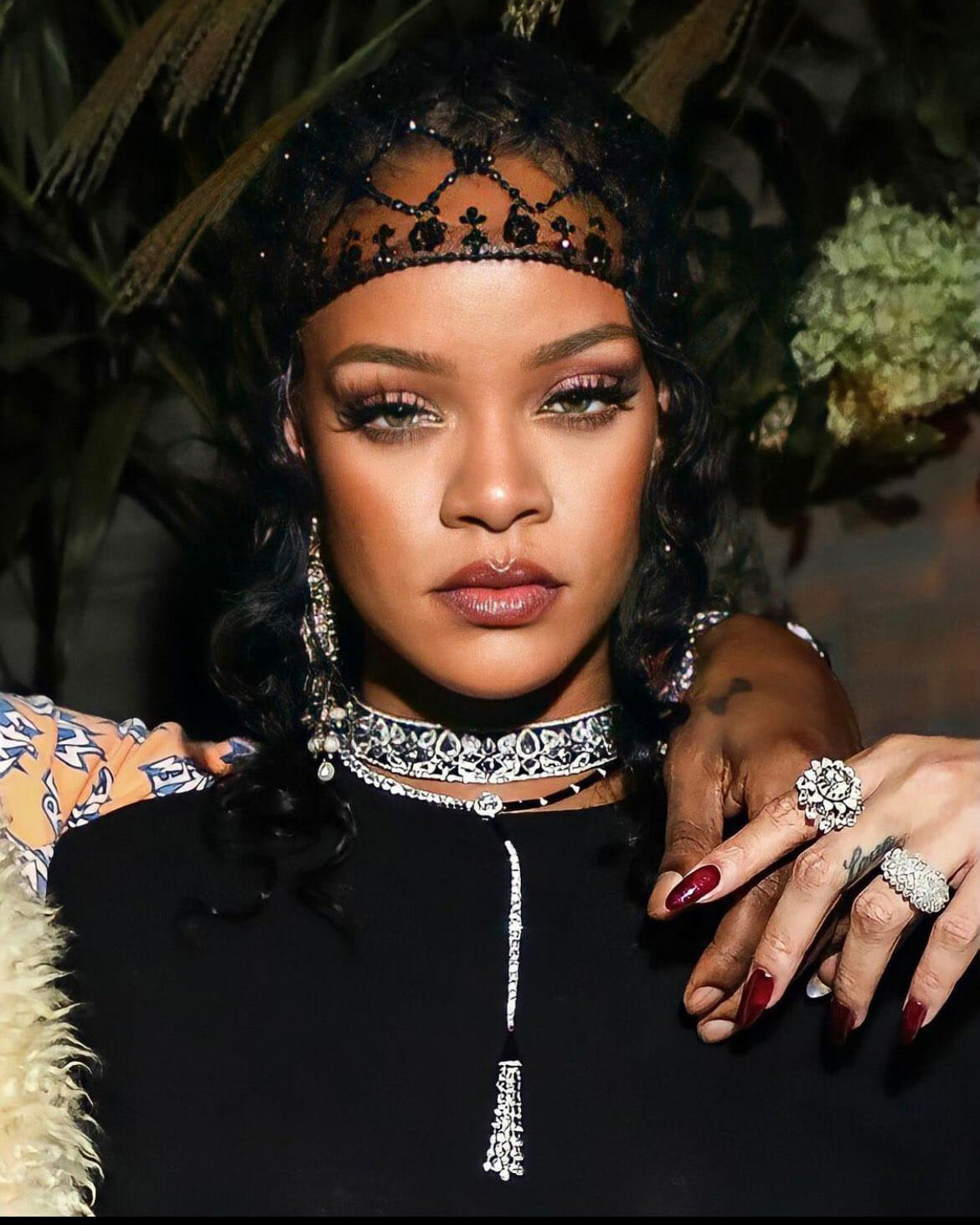
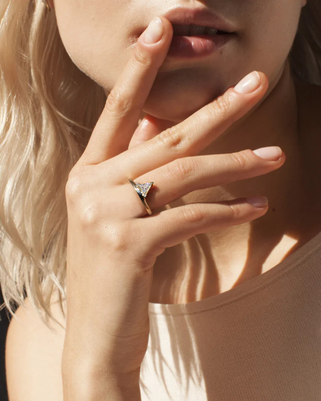
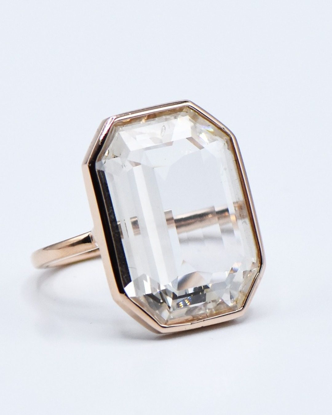
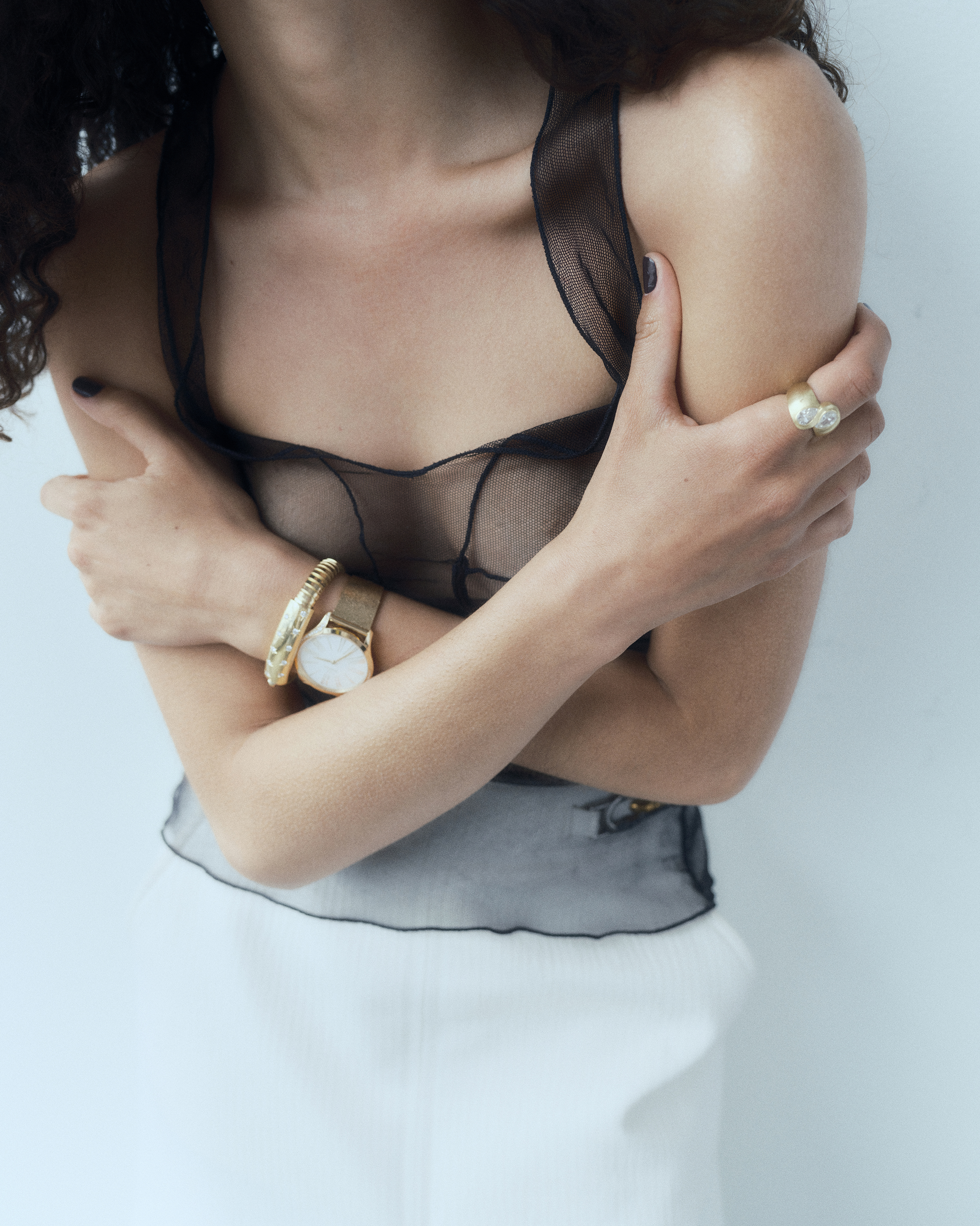
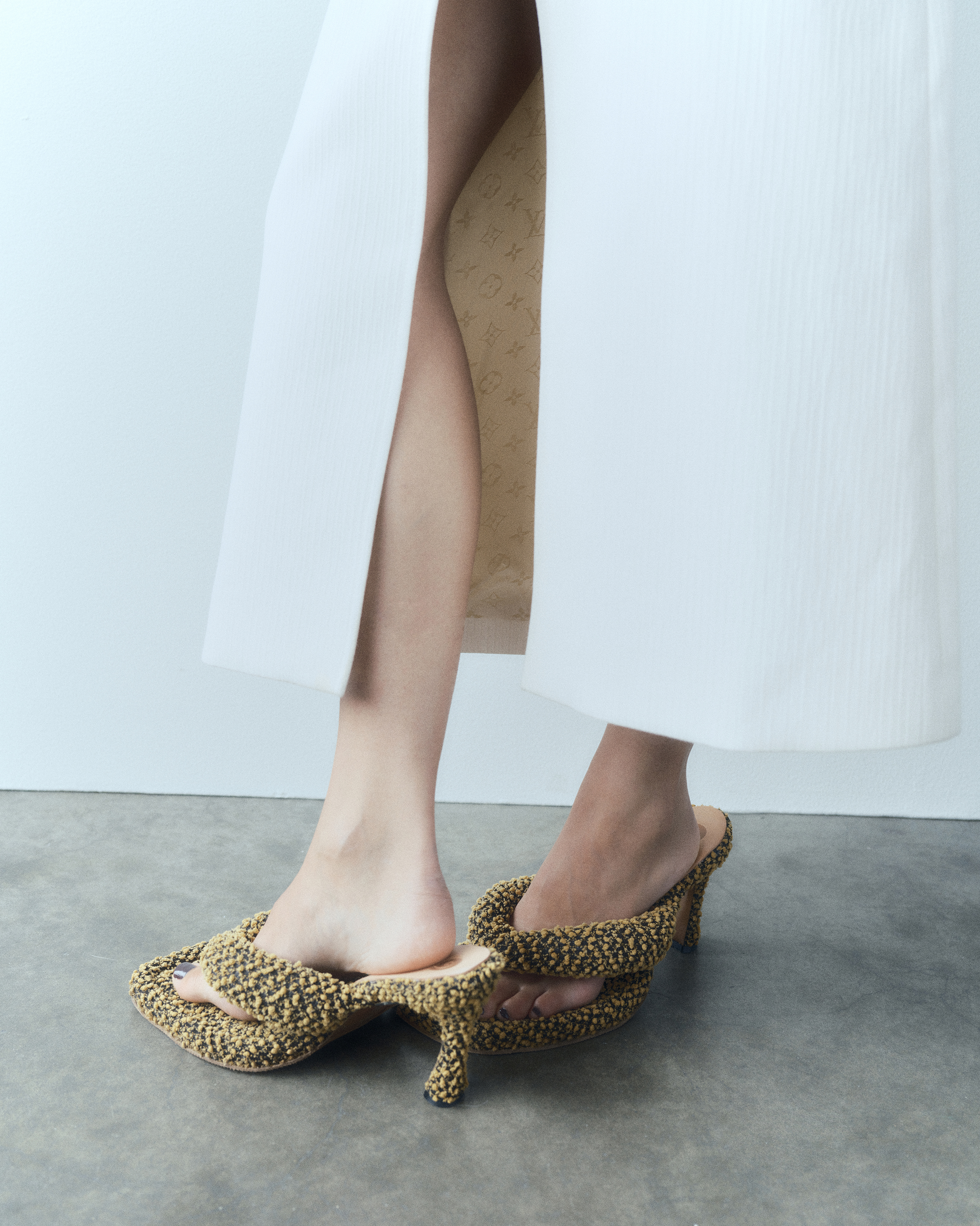
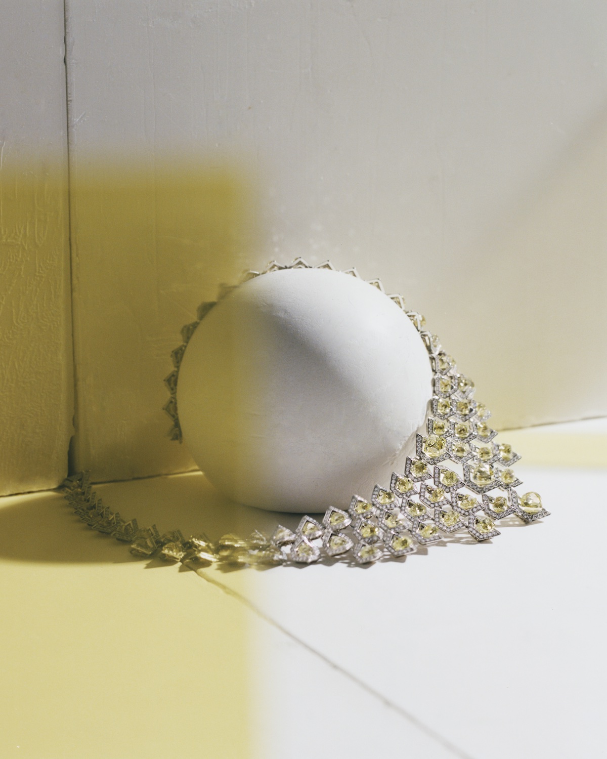
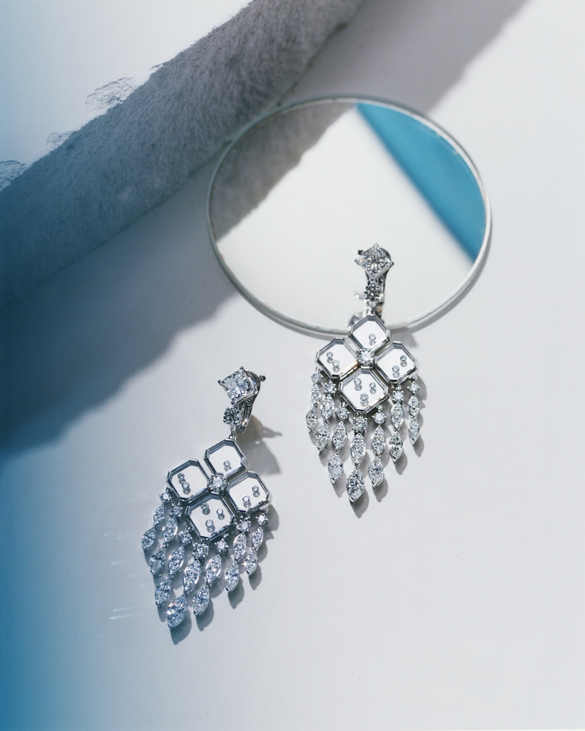
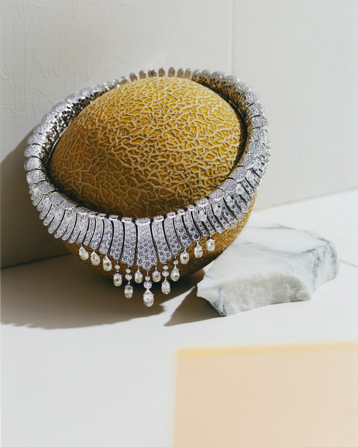
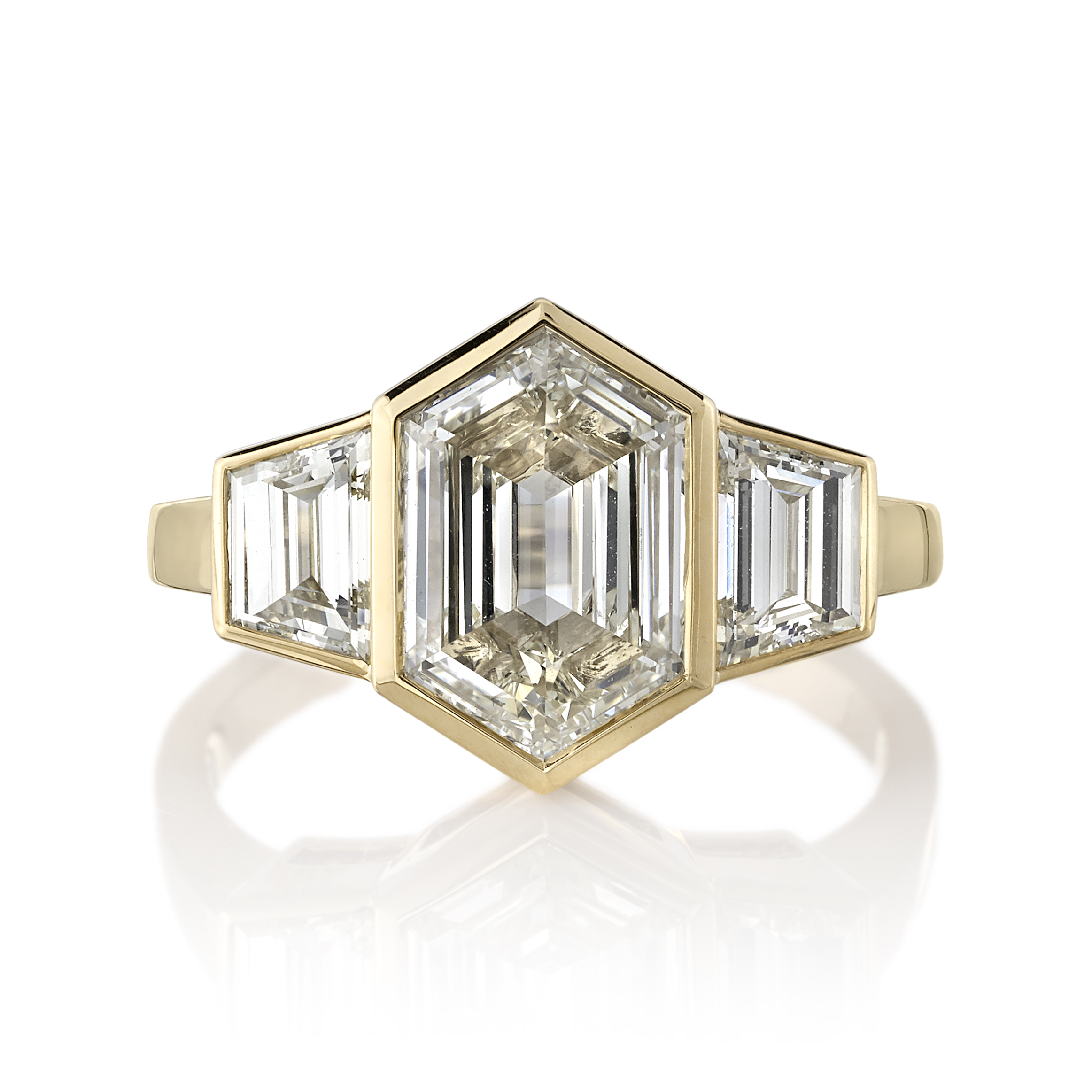
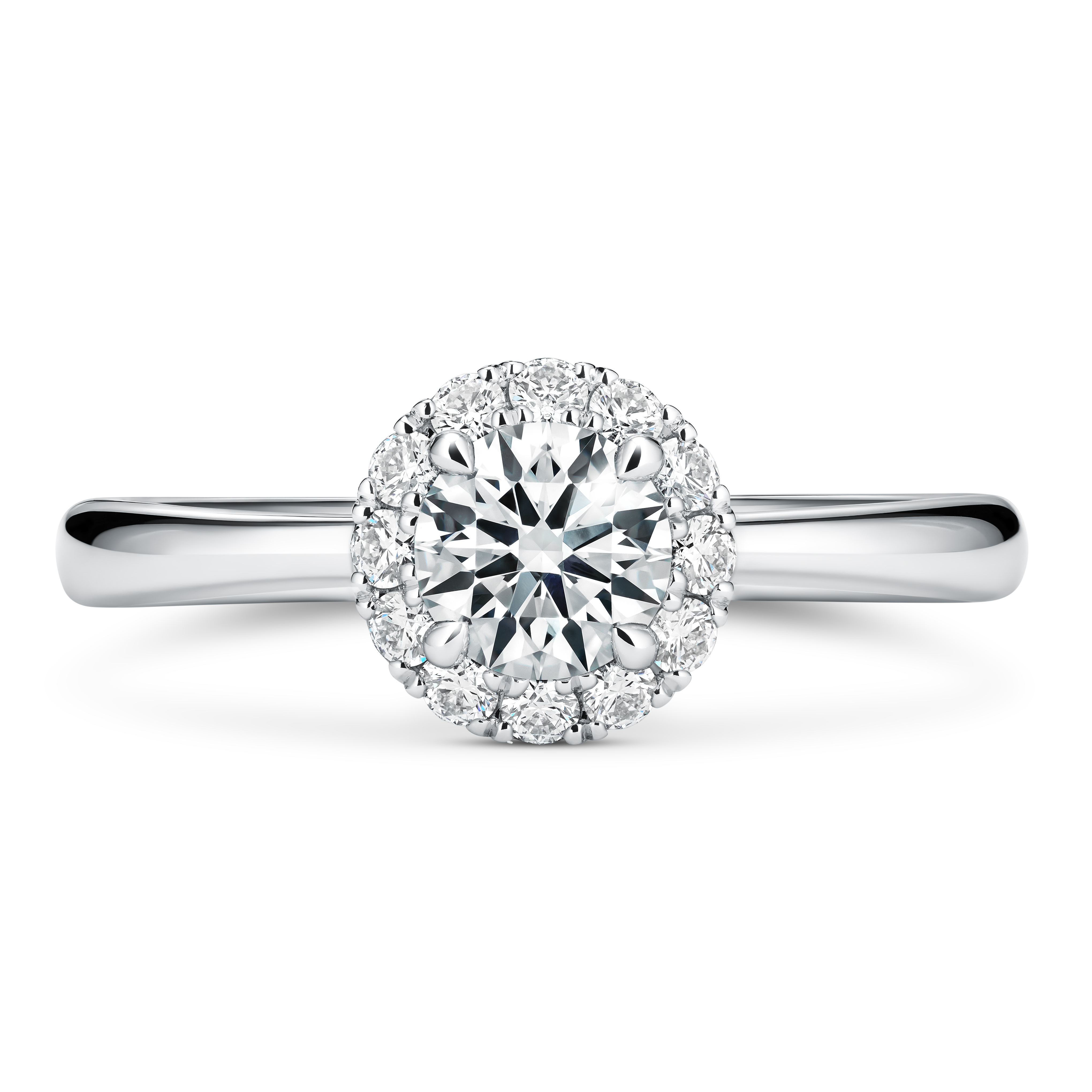
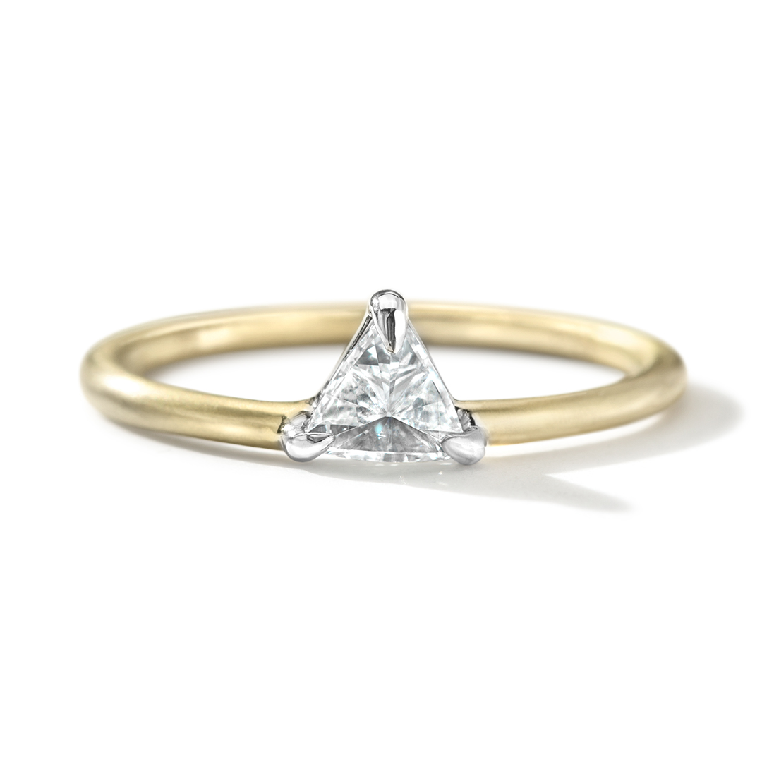
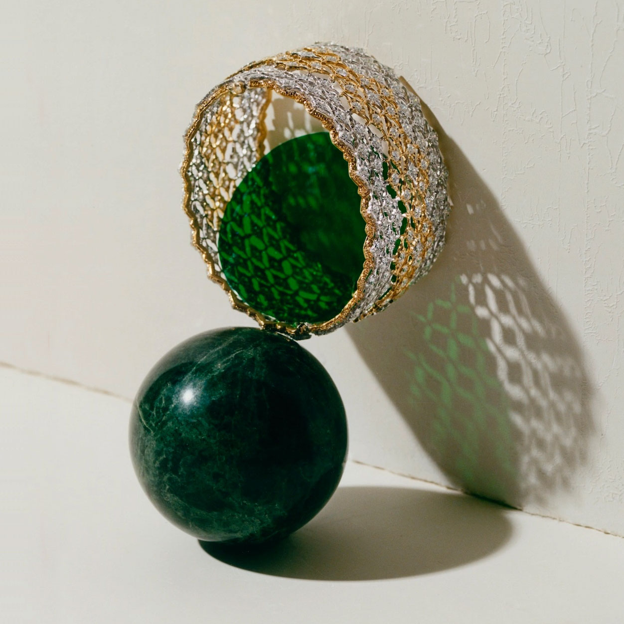
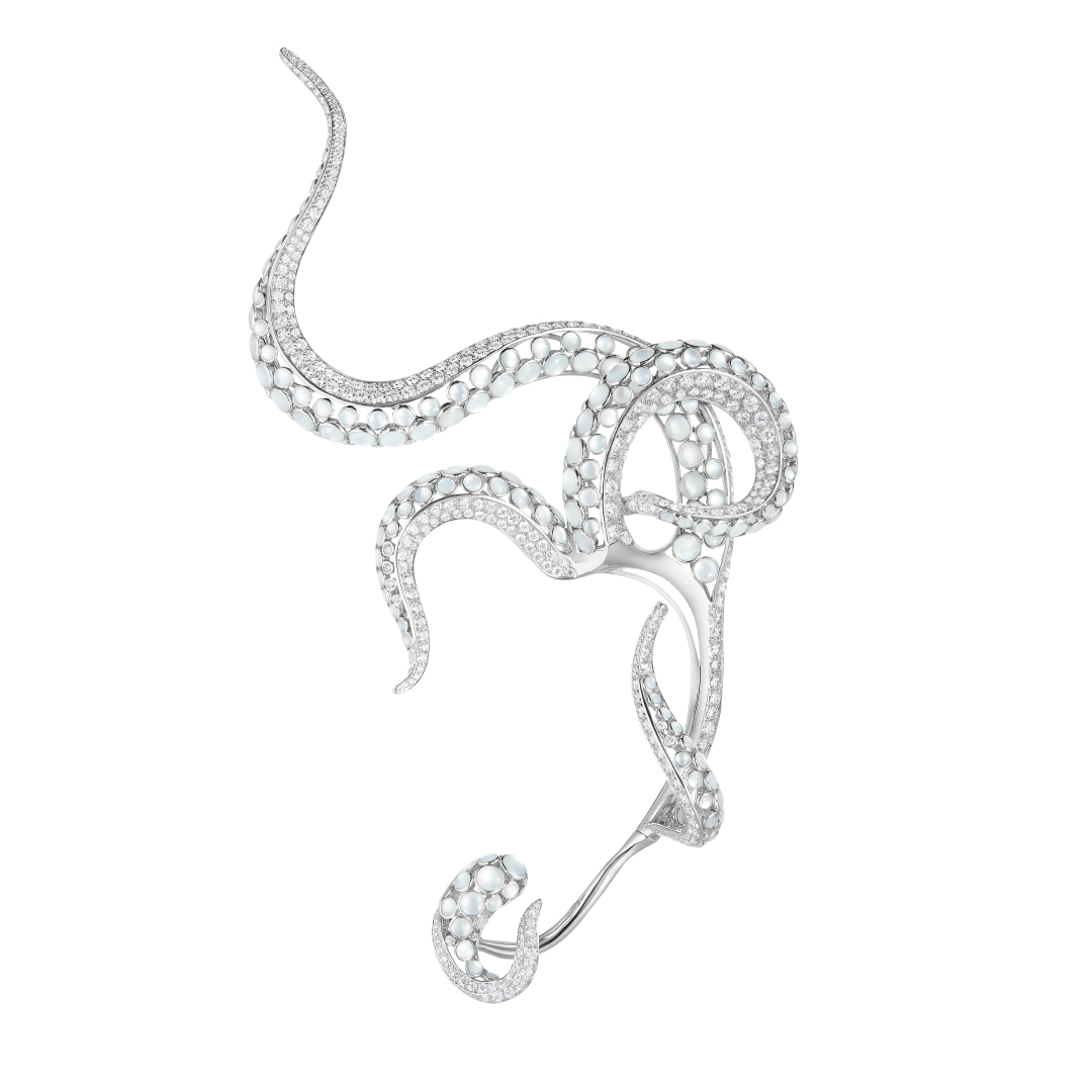
Fixed width images can be set to have a maximum width on desktop and, on mobile, have a small amount of padding on the left and right sides. These are used more than any other element by NDC. The width is set on the group in Block > Layout.
BUCCALLATI
—
La beauté plaît aux yeux,
la douceur charme l’âme
Below are a few different applications of the Editorial Featured Products Slider.
To display the slider as a grid, just click the ‘Display as static grid’ checkbox checkbox in the styling tab. A background and text colour can also be set.

SECTION 02
To insert a video loop click + Add Block where you want the video and then select Video Loop. This module allows you to add both a mobile and desktop video. This module is designed to only play the video loop when it’s visible on screen (in the viewport) and is ideal when many videos are placed on a page (e.g. as an alternative to gifs).
To insert a video click + Add Block where you want the video and then select Video. If you insert a YouTube video then no settings are available. If you add a link to a video on the NDC server or Vimeo then you have options for Autoplay, Loop, Muted, Playback controls and Play Inline (plays in position rather then opening in an overlay).
The Editorial Hero Media module requires a mobile (usually 4:5) and desktop (usually 16:9) loop and then a mobile and desktop full video, which is played when the user clicks Play.
There are controls in the Styling section for choosing the aspect ratio for desktop and mobile, along with the background colour and Disable follow play button, which stops the play button following the users cursor on desktop. You can also disable the small, scroll down arrow, which appears at the bottom of the video when enabled.
The Cover block can be used with video whenever custom typography needs to be overlaid onto a video. This is a high impact cover option for features.
Large Title
By adding a landscape image to a Cover module and clicking the toggle “Enable X-Axis parallax” in Settings > Mobile Settings the image will scroll from left to right on mobile as the reader scrolls down the article.

By adding a portrait image to a Cover module and adjusting the “Custom X-Axis” slider in Settings the image will scroll at a different speed to the page itself; using a parallax effect.
DIA 14PX TITLE
SECTION 04
INTRO PARAGRAPHS
A drop cap can give readers a good first impression of the article and establishes a visual hierarchy on the page, emphasizing the beginning of the article. Drop caps have been used in manuscript design for centuries and their use can evoke a sense of editorial rigour, subtly reenforcing the link with high quality, printed magazines.
Hierarchy FOR HEADINGS
A well-defined hierarchy for headings in a digital article serves multiple purposes, benefiting not just the reader but also content creators and web developers. For the reader, a clear hierarchy enhances scan-ability and readability. Readers often skim through digital articles, and strategically placed headings help them quickly identify what each section is about, thereby improving the overall user experience.
This clarity is crucial for accessibility, as screen readers rely on headings to navigate the content, making it more inclusive for visually impaired audiences.
From a content creation and publishing standpoint, a well-structured heading hierarchy can significantly impact search engine optimization (SEO). Search engines use heading tags to better understand and index content, which can lead to higher search rankings and increased web traffic.
Below are all of the responsive heading styles available on any article on the NDC website. Please note that, below this section, we outline additional large titles, for use in Cover Stories and Features, along with options for applying title styles to copy without affecting accessibility or SEO (e.g. large quotes that aren’t titles).
NATIVE H TAGS — NO ADDITIONAL STYLES
Below are all of the native / default headings that can be selected in WordPress.
We recommend adjusting the line-height to fine tune these depending on the usage. This can be done easily in WordPress using the Typography menu in Block settings by clicking the three dots on the right and selecting Line height. Please note that, as custom width on desktop is often key on larger titles, each of the blocks of text below are contained within a table, each of which has a width set in Block > ⚙ Settings.
APPLYING HEADING SIZES to Paragraphs
On occasions text needs to be resized without affecting search engines—which use the H tags (H1, H2, H3 etc) to establish the information hierarchy.
An example would be a pull-quote using the H3 font size—which is not meant to be indexed by Google as an H3 title. For this use case any typography can be styled using the presets in the settings Block > ◐ Styles > Typography > Size.
Paragraph with H1 Type Size
Paragraph with H2 Type Size
Paragraph with H3 Type Size
Paragraph with H4 Type Size
Paragraph with H5 Type Size
Paragraph With H6 Type Size Bold Text
Block quotes add a touch of flair and credibility. They break up the text and highlight key insights in editorial posts and interviews. This not only improves the article’s authority but also elevates its storytelling, making it more engaging and relatable for the reader.
The simplest way to add block quotes is to cut and paste the group below. To adjust the linebreaks, whilst ensuring responsive text reflow, simply change the width of the group in the Block > Layout settings.

this is a MEDIUM block quote, set to ‘H3 Editorial’ size, Ivar Display, Uppercase, with 1.3 line height and 0.5 letter spacing.
The Group is 590 PIXELS WIDE.
this is a MEDIUM block quote, set to ‘H3 Editorial’ size, Ivar Display, Uppercase, with 1.3 line height and 0.5 letter spacing.
The Group is 590 PIXELS WIDE.
this is a SMALL block quote, set to ‘H4 Editorial’ size, Ivar Display, Uppercase, with 1.3 line height and 0.5 letter spacing. The Group is 500 PIXELS WIDE.
There are four button styles available in the NDC website theme for different use cases, all of which are responsive to mobile, tablet and desktop and can be used interchangeably. To choose the outline or solid styles, or to change the color of the button and text, go to Block > ◐ Styles.
CUSTOM HEADINGS: COVER STORIES
For cover stories and features the default header can be hidden simply by clicking the “Disable default article heading” toggle in the Post settings. A custom editorial title can then be added using the L, XL and XXL styles in Block > ◐ Styles.
‘TITLE L’ FONT SIZE
‘TITLE XL’ FONT SIZE
‘TITLE XXL’ FONT SIZE
Ivar Text and Dia are only used for body copy & captions. Ivar Display and Ivar Fine are only used at large sizes for cover stories and feature titles. Ivar Headline is perfect for all commonly used titles & headings, including H1, H2, H3, H4 and H5.
IVAR FINE
Ivar Fine for XL Titles
IVAR DISPLAY
Ivar Display
for Large Titles
IVAR HEADLINE
Ivar Headline for Editorial Headings
IVAR TEXT
Ivar Text is the default font and is used for all body copy. Vivamus lacinia odio vitae vestibulum. Donec in efficitur leo. Pellentesque habitant morbi tristique senectus et netus et malesuada fames ac turpis egestas. Sed non urna in turpis suscipit facilisis. Vestibulum ante ipsum primis in faucibus orci luctus et ultrices posuere cubilia curae; Praesent quam turpis, dignissim et, consequat in, porttitor eget, orci. Aenean pretium, orci vel ultrices dapibus, ipsum metus lobortis ante, ac tincidunt urna erat et tortor.
DIA
Dia is used for excerpts and captions, often in bold caps or caps. Vivamus lacinia odio vitae vestibulum. Donec in efficitur leo. Pellentesque habitant morbi tristique senectus et netus et malesuada fames ac turpis egestas. Sed non urna in turpis suscipit facilisis. Vestibulum ante ipsum primis in faucibus orci luctus et ultrices posuere cubilia curae; Praesent quam turpis, dignissim et, consequat in, porttitor eget, orci. Aenean pretium, orci vel ultrices dapibus, ipsum metus lobortis ante.
ADJUSTING FONTS & LINE HEIGHT
Whenever custom sizes are used for long titles, pull quotes or paragraphs, the font and line height will need to be adjusted. This is done in Block > Typography by selecting ‘Font family’ and ‘Line height’ — see examples below.
Paragraph Set to H1 Editorial Size in Ivar Fine with 1.2 Line Height
Paragraph Set to H2 Editorial Size in Ivar Display with 1.3 Line Height
Paragraph set to H3 Editorial size in Ivar Display with 1.3% line height – often used in pull quotes.
Paragraph Set to H4 Editorial size in Ivar Display with 1.3 line height – often used in pull quotes.
Paragraph Set to H5 Editorial size in Ivar Display with 1.4 line height – often used in pull quotes.
Paragraph Set to H6 Editorial Size in Ivar Display with 1.4% Line Height. Captions offer a brief explanation of images, video loops, or other visual elements on the page. They help contextualize the visual content for the reader and should therefore be clear and concise. These can also be used in ALL CAPS BOLD and ALL CAPS for credits.
Paragraph set to H3 Editorial size in Ivar Display with 1.3% line height – often used in pull quotes. Nunc blandit ligula ac sem faucibus, eget sollicitudin libero pellentesque. Nullam erat metus, viverra et tortor eu, pellentesque dignissim orci. Sed sed consequat quam, eu ornare quam. Suspendisse vel purus ac dolor eleifend fermentum sed sit amet ante. Integer et lectus et nibh suscipit auctor id nec nisi. Aenean malesuada orci odio, vitae porta dolor blandit rhoncus.
Paragraph Set to H4 Editorial size in Ivar Display with 1.3 Line Height – often used in pull quotes. — Lorem ipsum dolor sit amet, consectetur adipiscing elit. Nunc blandit ligula ac sem faucibus, eget sollicitudin libero pellentesque. Nullam erat metus, viverra et tortor eu, pellentesque dignissim orci. Sed sed consequat quam, eu ornare quam. Suspendisse vel purus ac dolor eleifend fermentum sed sit amet ante. Integer et lectus et nibh suscipit auctor id nec nisi. Aenean malesuada orci odio, vitae porta dolor blandit rhoncus.
Paragraph Set to H5 Editorial size in Ivar Display with 1.4 Line Height – often used in pull quotes. — Lorem ipsum dolor sit amet, consectetur adipiscing elit. Nunc blandit ligula ac sem faucibus, eget sollicitudin libero pellentesque. Nullam erat metus, viverra et tortor eu, pellentesque dignissim orci. Sed sed consequat quam, eu ornare quam. Suspendisse vel purus ac dolor eleifend fermentum sed sit amet ante. Integer et lectus et nibh suscipit auctor id nec nisi. Aenean malesuada orci odio, vitae porta dolor blandit rhoncus.
SECTION 04
CUSTOM COLUMN ORDER
It is possible to set the order of any columns so that these are different to desktop when stacked on mobile. For example, when previewing the boxes below on mobile, the order is 01, 02, 03—whereas on desktop it is 03, 01, 02
EDITORIAL SOCIALS
Social media share icons can be added anywhere in a post using the ‘Editorial Socials’ module. A checkbox allows for the addition of custom links.
SECTION 05
RELATED POSTS
The Editorial Related Posts module can be inserted anywhere in a post and provides added value to readers by directing them to additional content that complements or deepens their understanding of the topic at hand. This not only increases the time spent on the website, but also improves SEO performance, as it creates a more interconnected, easily navigable web of content that search engines view favorably.
DEFAULT BLOCK QUOTES
Block quotes add a touch of flair and credibility. They break up the text and highlight key insights in editorial posts and interviews. This not only improves the article’s authority but also elevates its storytelling, making it more engaging and relatable for the reader.
Native Block Quotes can be added to any post simply by selecting the Quote icon above any block of text.
A citation can also be added
The alternative way to add block quotes is to cut and paste the groups shown in the Typography section at the top of this page. These include the large speech marks and look better on mobile than the default quotes above.
Media and Text
This module is ideal for stacking products with information when the images have a transparent background. The stacked version is here: Media & Text Blocks & Pattern.
Sed posuere consectetur est at lobortis. Cras mattis consectetur purus sit amet fermentum. Cras justo odio, dapibus ac facilisis in, egestas eget quam. Donec id elit non mi porta gravida at eget metus. Sed consectetur est at lobortis.
Caption Designer / Product Link.
FOOTER CREDITS
Photographer/Director: Shaniqwa Jarvis
Stylist: Thomas Christos Kikis
Hair: Larry Sims
Makeup: Fiona Stiles
Manicurist: Thuy Nguyen
Bookings Editor: Glynis Costin
Creative Production: Petty Cash Production
Director of Photography: Raj Debah
Photo Assistants: Keith Kleiner, Peter Baker, Irene Tang
Set Design: Winston Studios
Fashion Assistant: Sydney Engelhart
Tailor: Victoria Gokun